

Last fall when Joanne and I went to London, COVID, while not gone, seemed to be on the wane.
Yes, we had to have proof of vaccination prior to leaving the states. And we were tested immediately upon arrival. And tested again the day before we left.
A pain in the ass? Yes, but only a minor pain.
The restaurants? Most had reduced their operating hours substantially – “Closed Sunday, Monday and Tuesday”…”Closed for lunch until further notice”…Open only until 9:00 PM.” You get the idea. Whether the limited days and hours were due to COVID or labor shortages, I don’t know. Probably a combination of both.
A few days ago Joanne and I returned from London.
And things seem to be back to normal. London was packed. The hotels were packed. The theaters were packed. The restaurants were packed.
In 2019 tourist visits to London amounted to 21 million people. In 2021 that number fell dramatically to 2.6 million. But 2022 forecasts are for a whopping 29 million and WE FELT IT. But we were glad to see London back.
So what were our takeaways this year?
Well, our favorite restaurant haunts appear to be fully staffed and back to normal hours. Also, there are some exciting new kids on the block. I’ll post about all of them in the coming months.
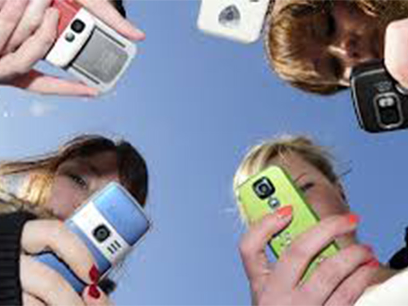
But this posting isn’t about restaurants or food. It’s about “beacons of tradition,” “cultural icons,” lost coins, and dropped calls.
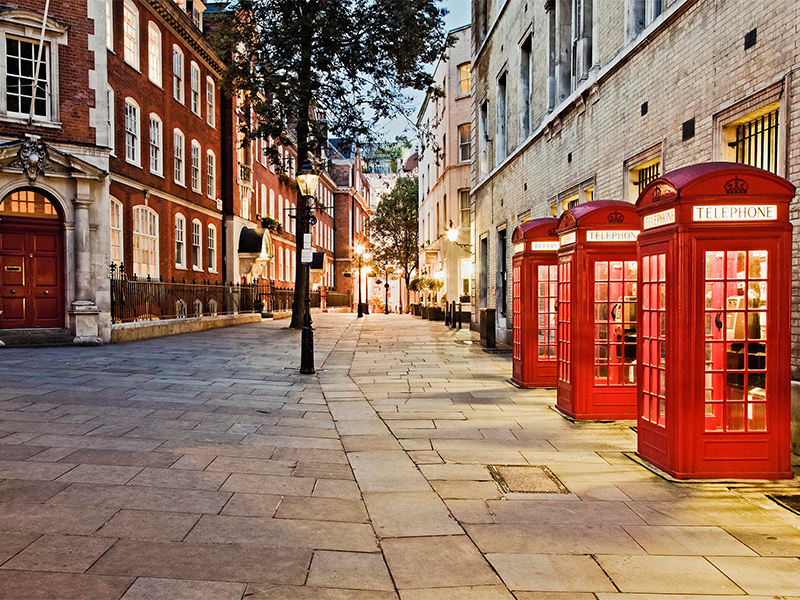
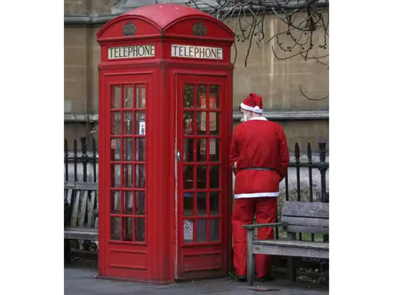
We’ll begin with one of the most recognized archetypes around the world: THE BRIGHT RED BRITISH PHONE BOX.
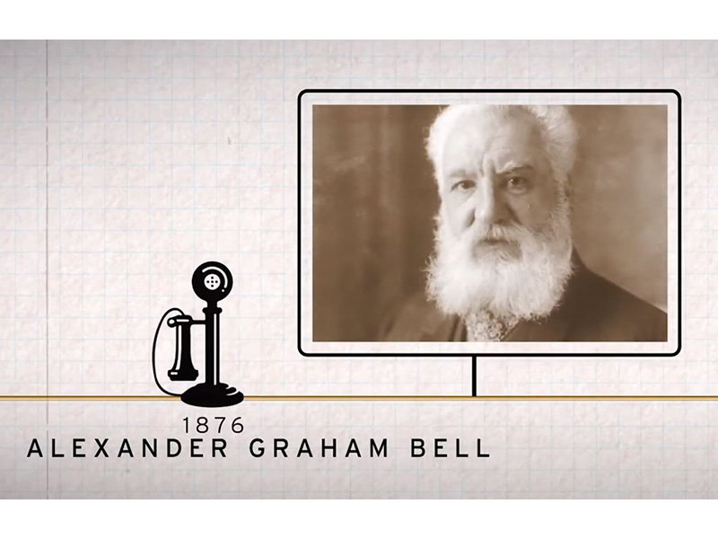
It was all made possible by University College London grad Alexander Graham Bell, in 1876. A few short years later, in 1891, a telephone cable was laid across the floor of the English Channel, facilitating phone calls between England and France.

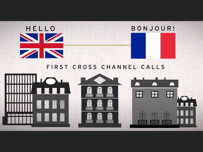
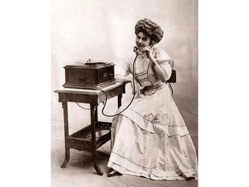
Truth be told, the vast preponderance of calls were between London and Paris. The countryside was basically left out. And for a few years, only very wealthy homeowners had phones (remember the Downtown Abbey episode about the hoopla surrounding their new home phone?)
By the early 1920s, even though the majority of middle class folks still couldn’t afford a phone in their house, the UK Post Office introduced the first phone boxes to the city of London, allowing the vast population access to the phone lines. The phone box, dubbed the K-1, was concrete on three sides with a bright red wooden door in the front. The concrete was not a good solution as it chipped, cracked, stained and deteriorated rapidly.
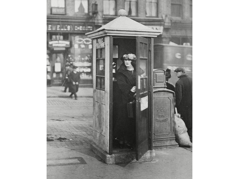
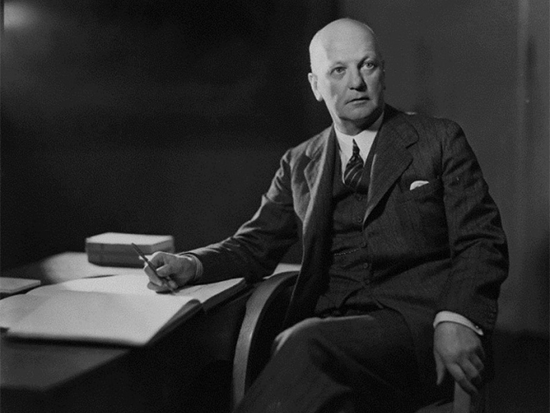
In 1924, a design competition was held to create a new and durable phone box. The winner was the well-known architect, Giles Gilbert Scott, who created the K-2: a cast-iron box that was strong, sturdy and tough…except for the wooden door. It was also painted bright red, some say so it could be easily spotted in the London fog. Critics claim that it was modeled after the Sloane family tomb in the burial yard of Saint Pancras church. The price of the K-2 was 40 pounds.
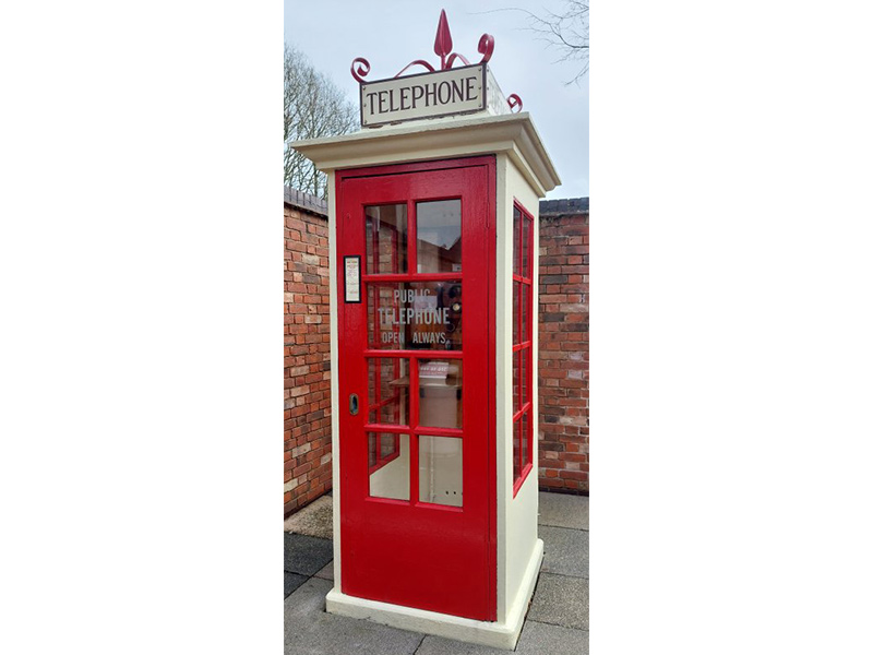
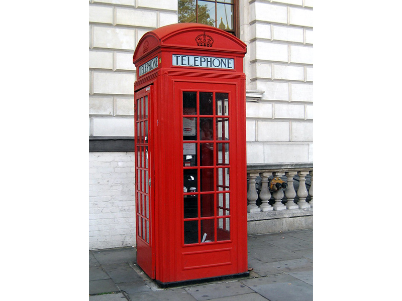
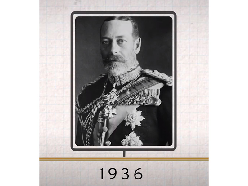
Celebrating the Silver Jubilee and his coronation as king in 1936, George VI (Queen Elizabeth’s father) commissioned another design competition to improve upon the K-2. The winner? Once again, it was Giles Gilbert Scott, creator of the K-8. That iteration of the box is most often seen in London today. It became known as the JUBILEE KIOSK. Comparing it to the K-2, the K-8 was about a foot shorter, had a slightly smaller foot-print and larger panes of glass to let in more light. Nineteen thousand were forged (with cast-iron doors this time) until production ceased in 1968.
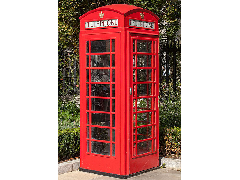
And in 2015 the PHONE BOX was named THE GREATEST BRITISH DESIGN OF ALL TIME!
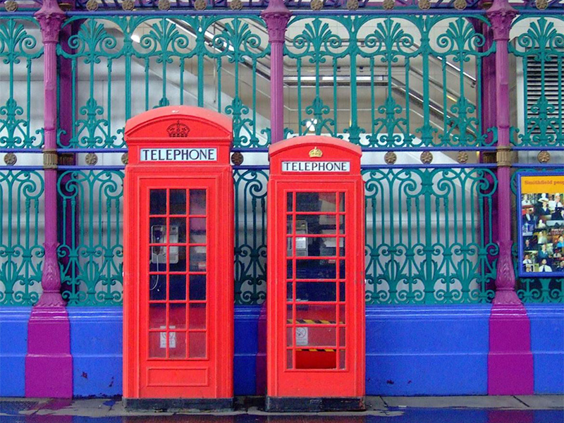
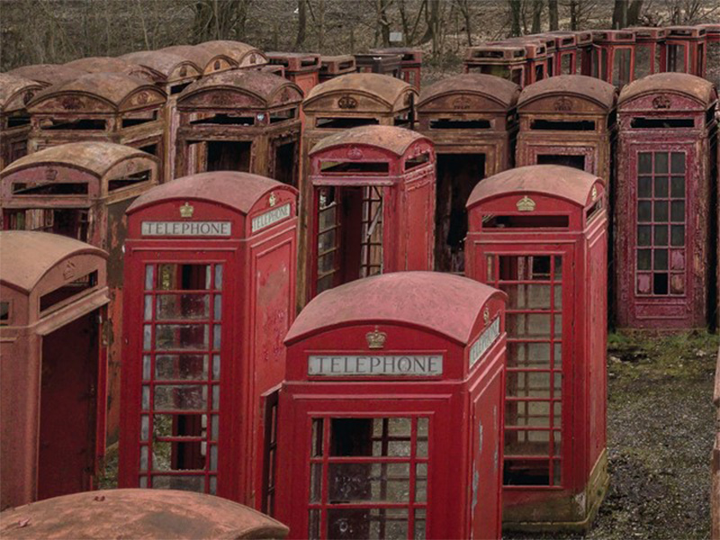
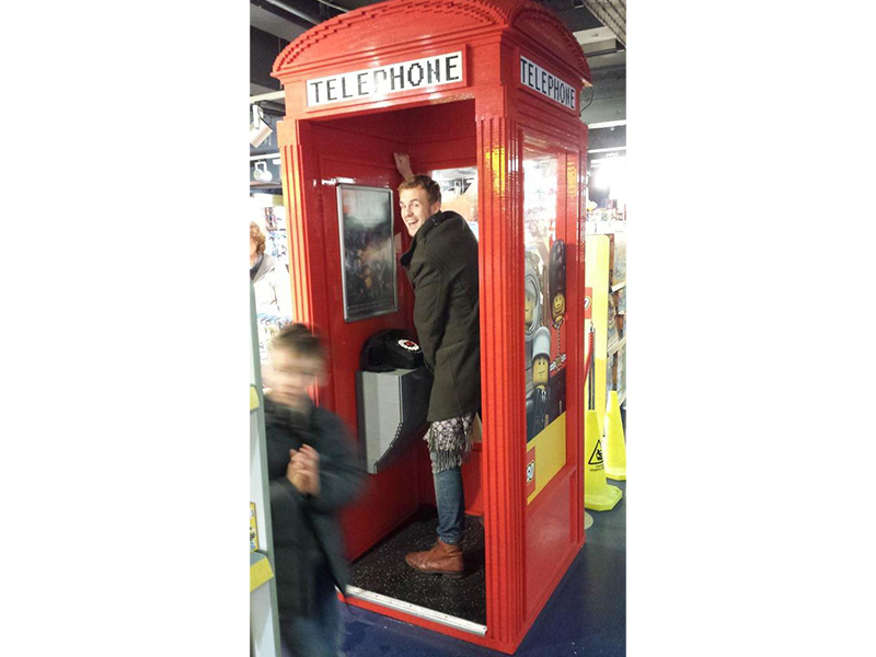
Phone booths had a pretty good run until the cell phone entered the picture. Almost at once, they became irrelevant, a symbol of a bygone era, and thousands sadly were regulated to the PHONE BOX GRAVEYARD of London.
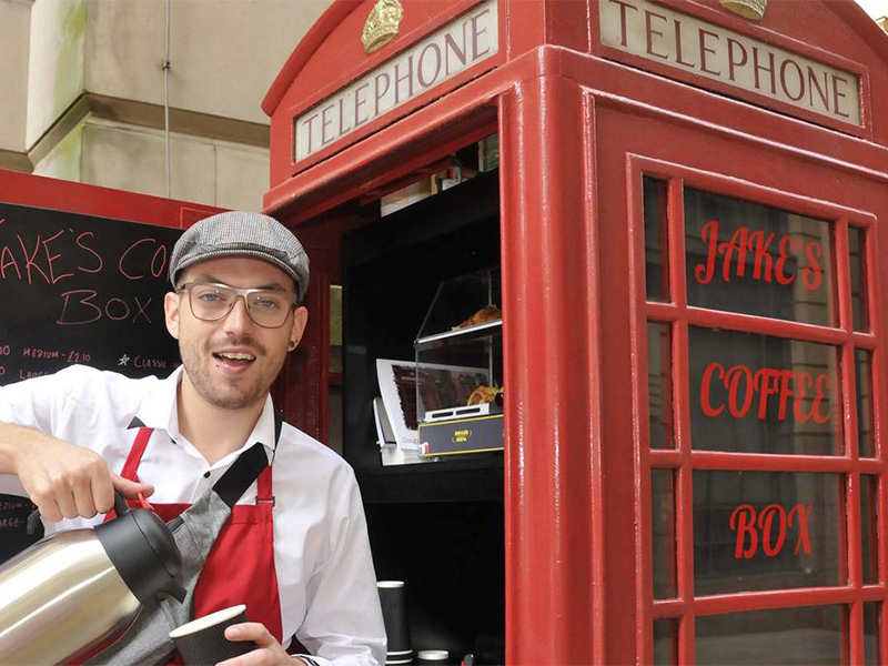
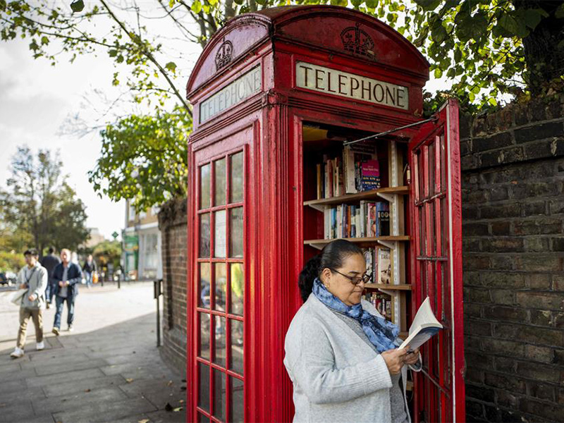
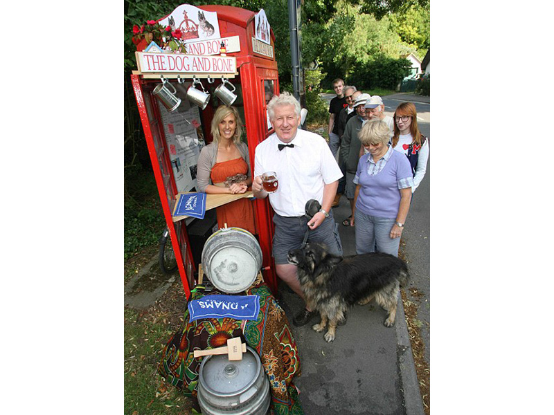
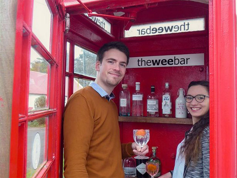
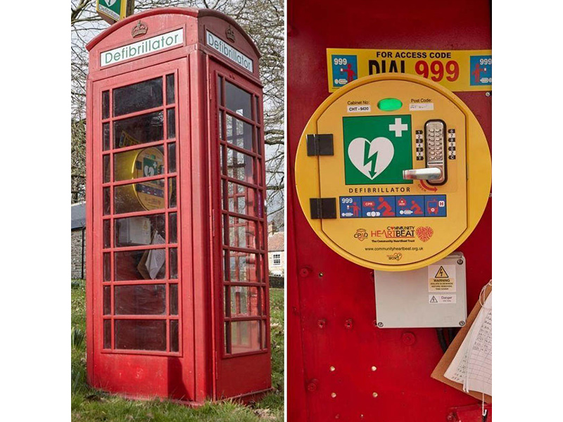
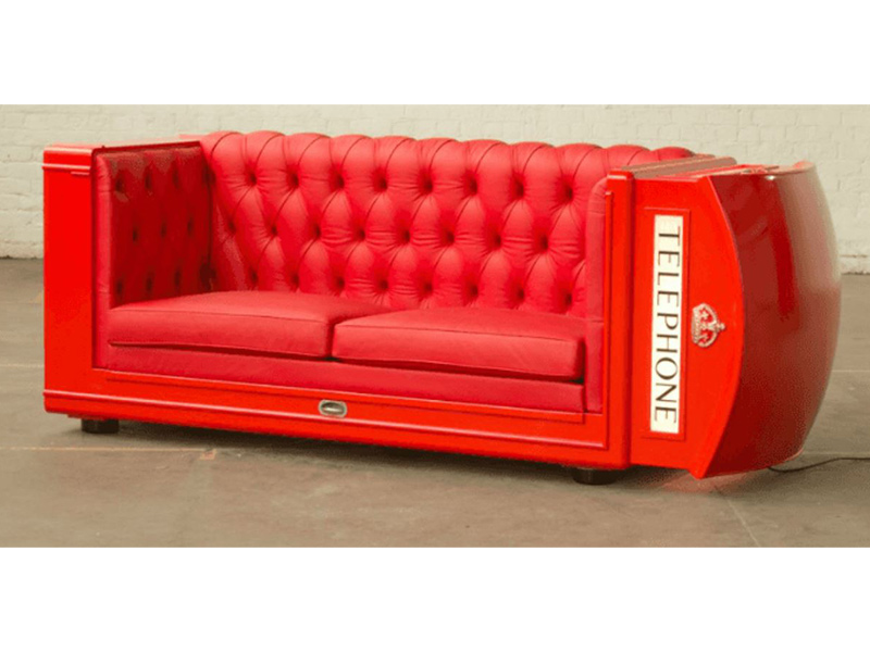
But…leave it to Londoners to get creative. Among the surviving phone boxes around town, many have been re-purposed – some as coffee bars, others as libraries, beer pubs, hard liquor dispensaries, defibrillator stations, furniture and, way too often, as PUBLIC CONVENIENCES.
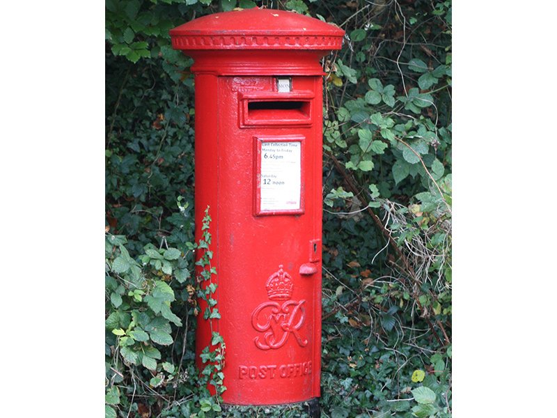
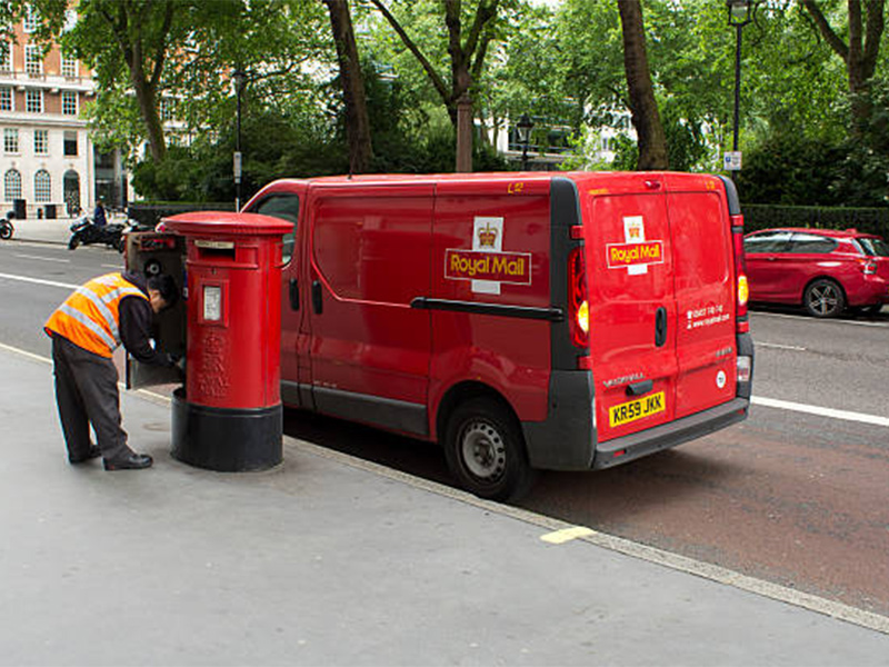
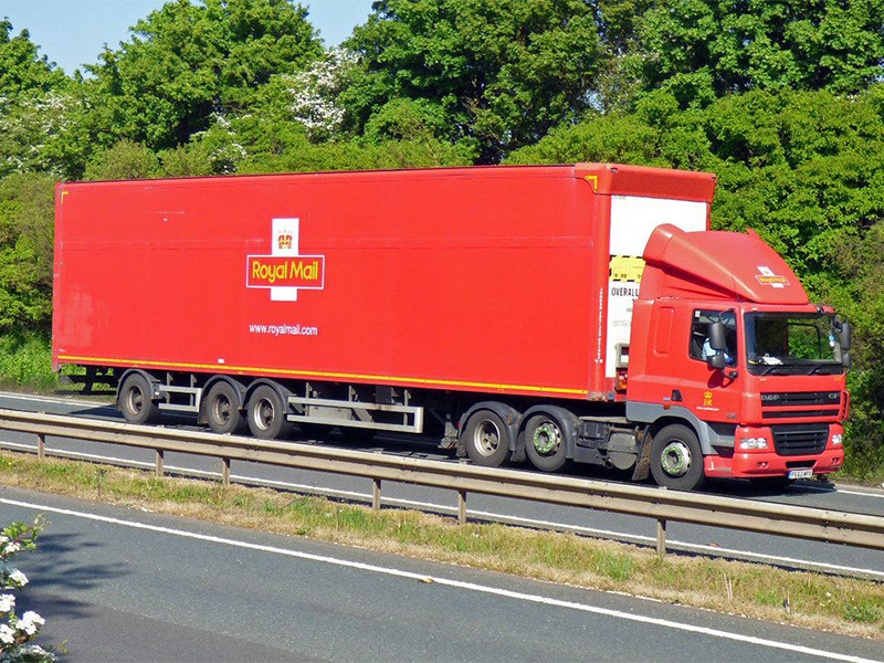
So, on to THE ROYAL MAIL and the VIVID RED LETTER BOXES.
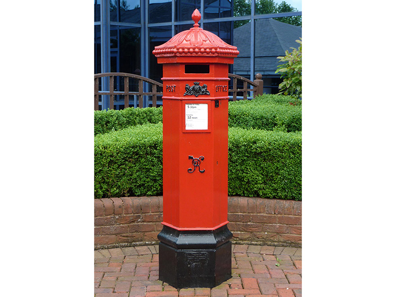
Introduced in about 1850, the original letter boxes were painted in various hues of green. There was OLIVE GREEN, SAGE GREEN and BRONZE GREEN, each for a different category of mail. But London residents complained that the green letter boxes were indistinguishable from one another and also hard to find (in the perpetual London fog). Postal officials attempted to address the public’s concerns with a band-aid solution that treated all the boxes with a coat of high-gloss varnish. Didn’t solve the problem.
In 1874, the postal service decreed that all letter boxes in existence and going forward be painted BRIGHT RED. Hmm, did the phone company take a page out of the postal service playbook by painting their phone boxes red?
Now the letter boxes are about to change…in a subtle way. I’ll explain.
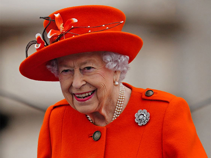
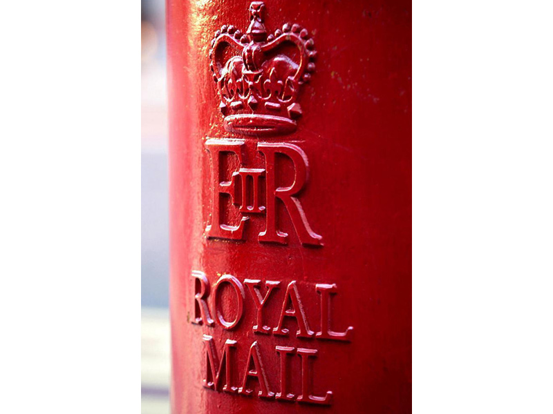
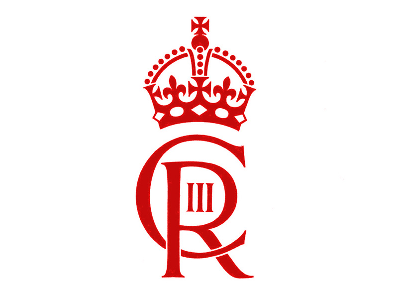
The letter boxes each carry THE ROYAL CIPHER of the reigning monarch. A cipher is a secret way of messaging in order to disguise its meaning. Queen Victoria was the first to place her cipher on a letter box in 1901. George VI emblazoned the red boxes with his cipher from 1936 until 1952 when he died. Upon her coronation, Elizabeth’s royal cipher was cast onto the bright red letter boxes. And now the cipher of King Charles III will begin to appear on the new boxes.
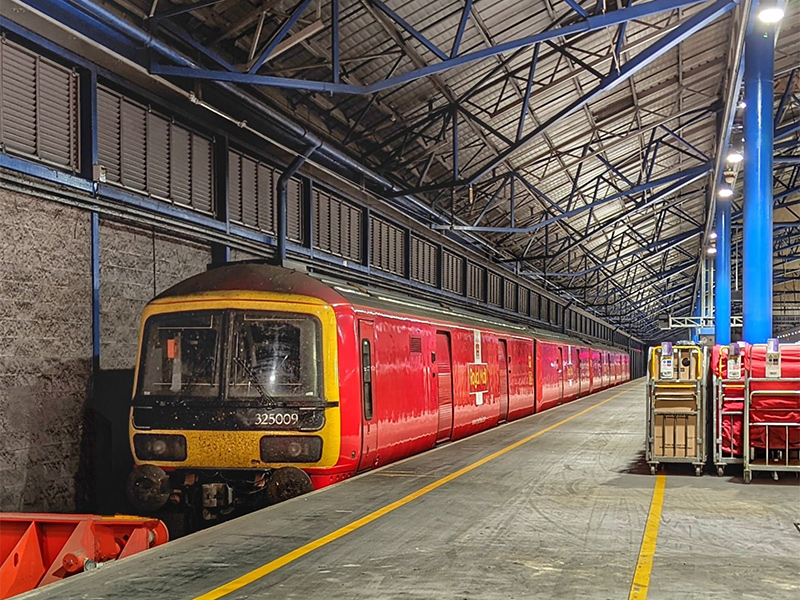
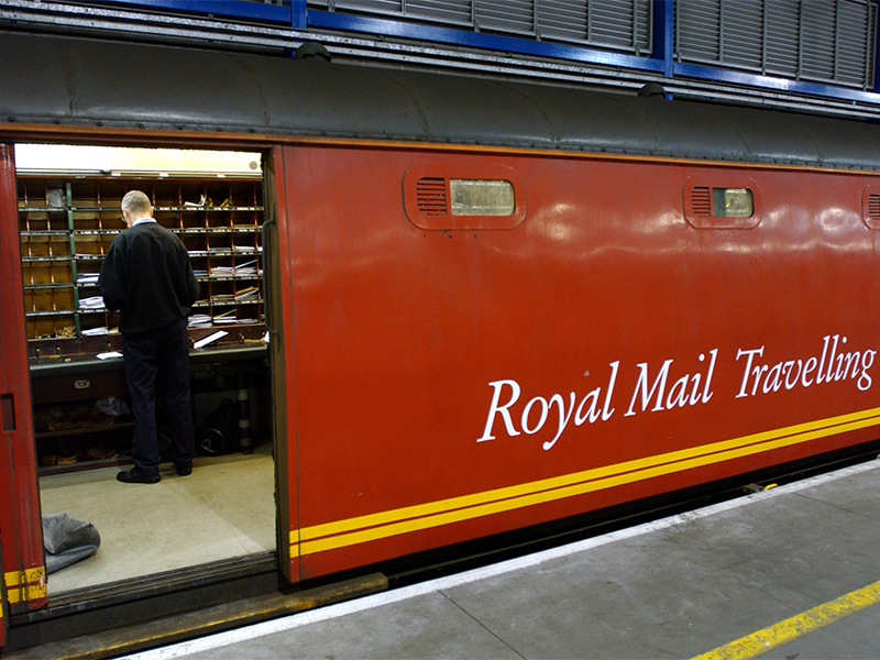
And check out the ROYAL MAIL TRUCKS – bright, bright red. And the Royal Mail Trains. Just as bright, just as red.
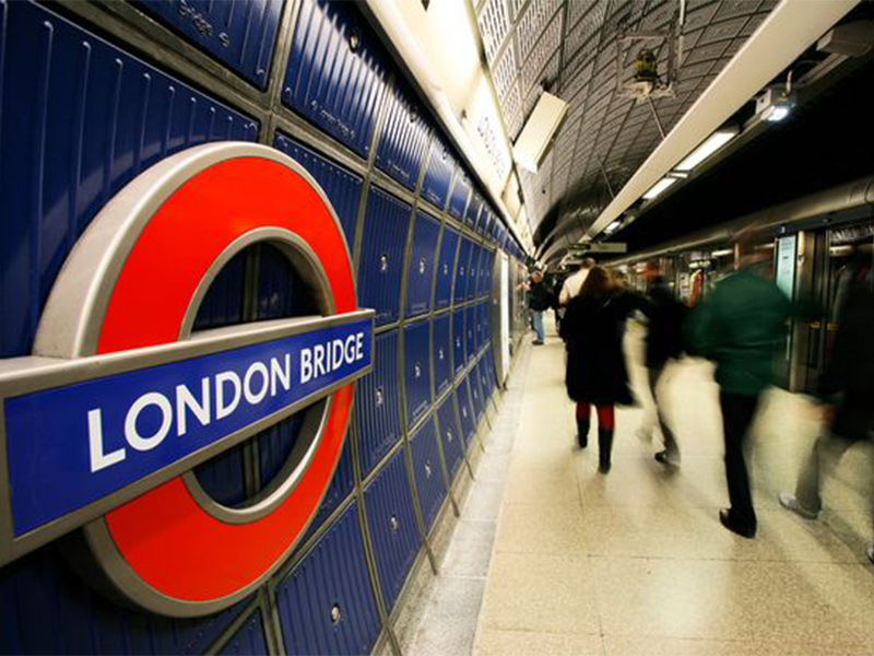
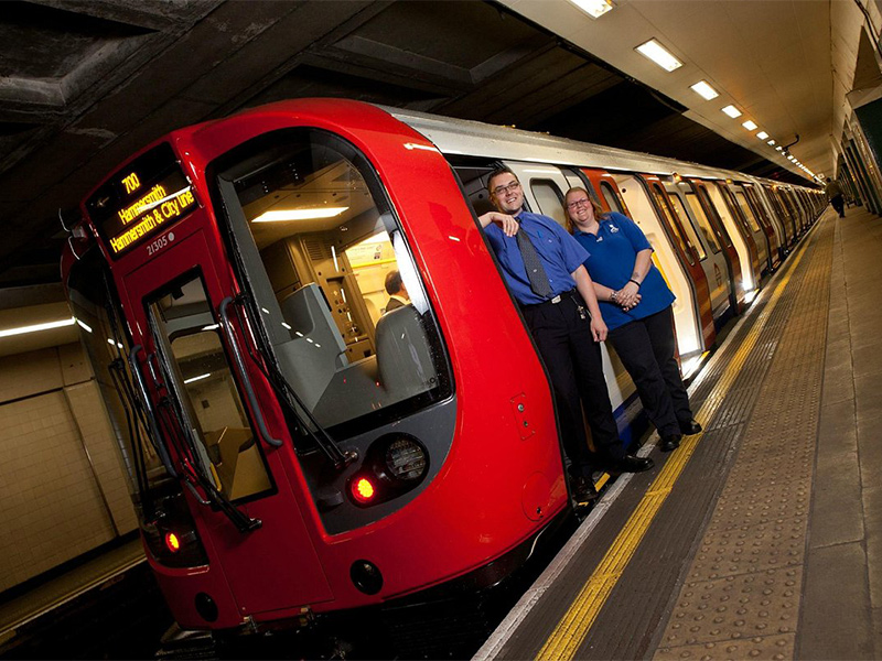
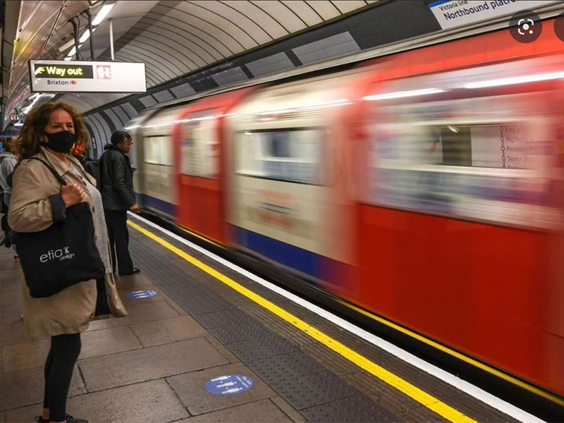
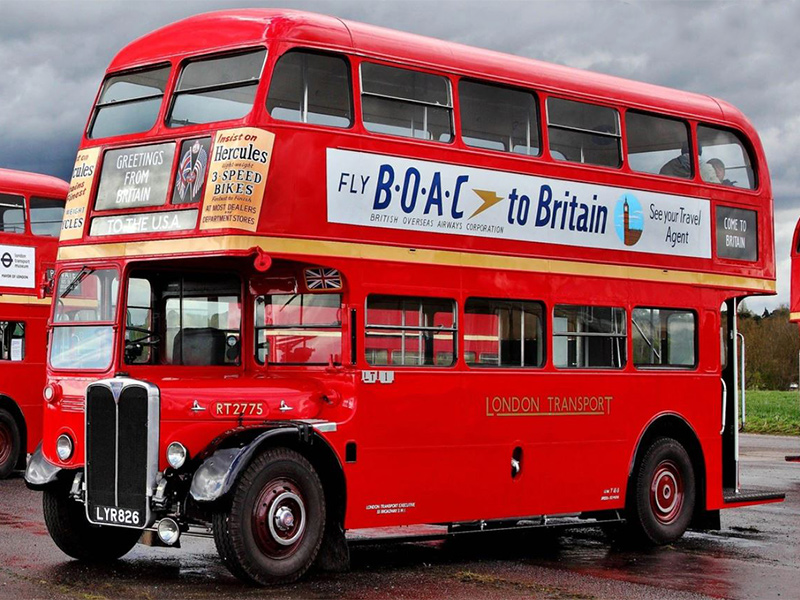
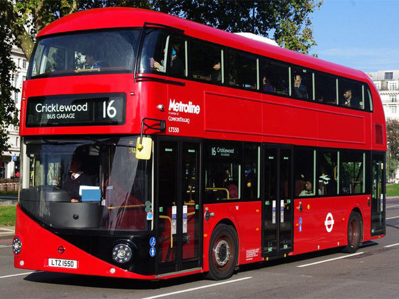
I was puzzled as to why the phone boxes, mail trucks, mail trains, signage, the underground trains in the Tube, and even the buses of London all sport what appears to be the exact same red as their “Mother Color.” The London buses were painted red as early as 1907 and then came the classic RED ROUTEMASTER bus, which was introduced in 1956 and followed by the fleet of sleek and arresting red BORIS BUSES (yeah, named after him) that command our attention on the streets of London today.
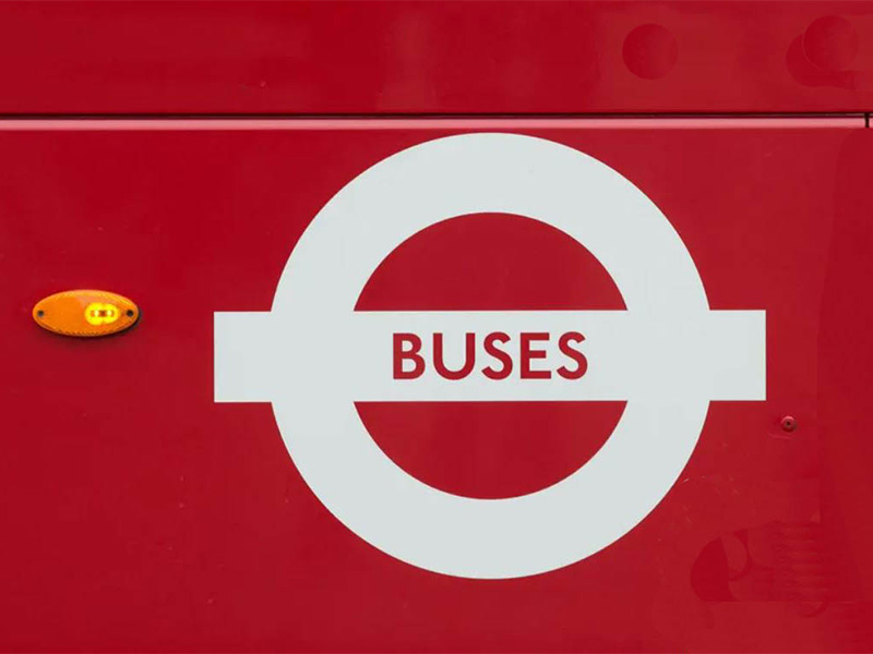
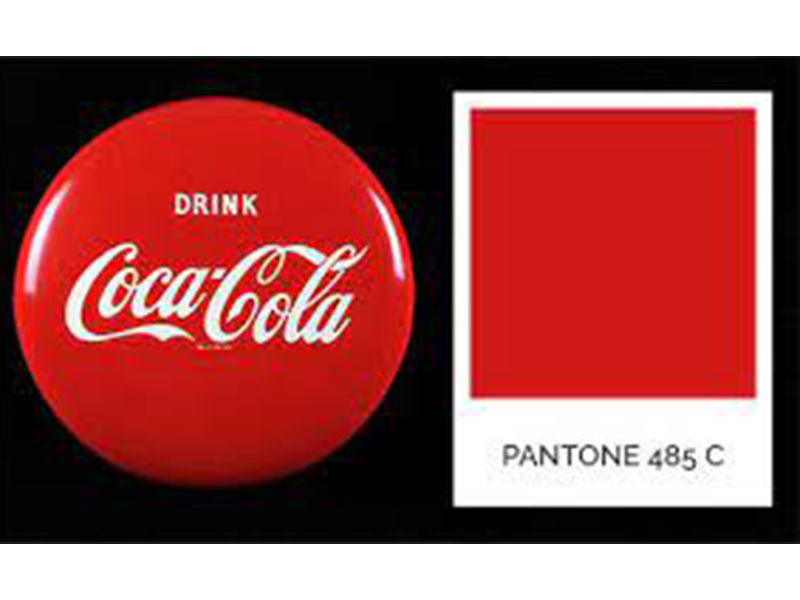
And then I read that somewhere along the brand development of the Royal Mail, the Pantone Color 485C was designated as their official color. Did they hire a design firm to develop brand standards? Did the postal service, the underground and the bus company all hire the same branding outfit?
Or did they just copy one another because the bright red 485C stood out and was instantly recognized on thick, foggy days?
I am very impressed with the brilliant branding that was achieved, but I remain puzzled as to how they all got there.
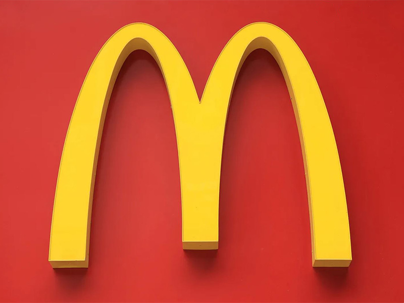
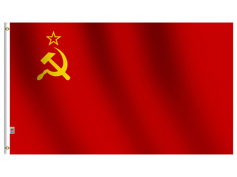
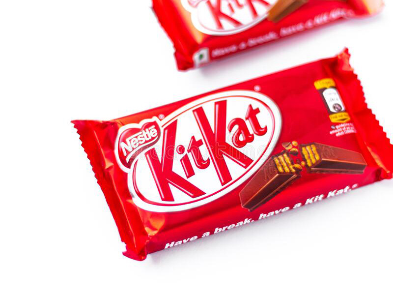
Branding with color is an important part of the “tool kit” that designers use in messaging to the consumer. Think about COCO COLA…McDONALDS…THE OLD SOVIET FLAG…KITKAT CANDY BARS. They all use red 485C – same as London buses, the Royal Mail, phone boxes and the underground.
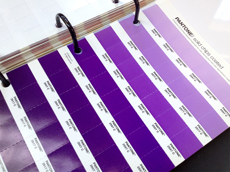
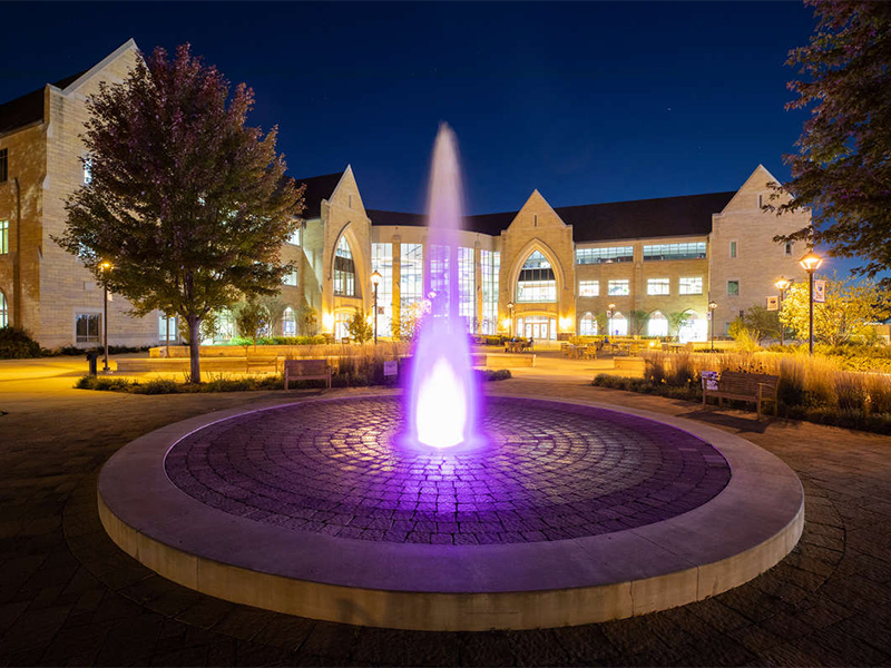
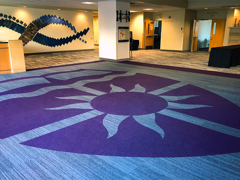
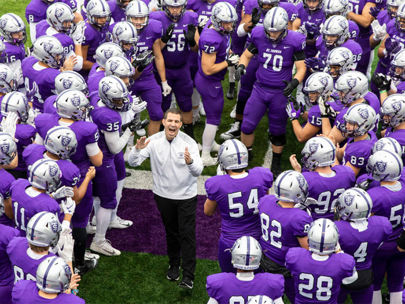
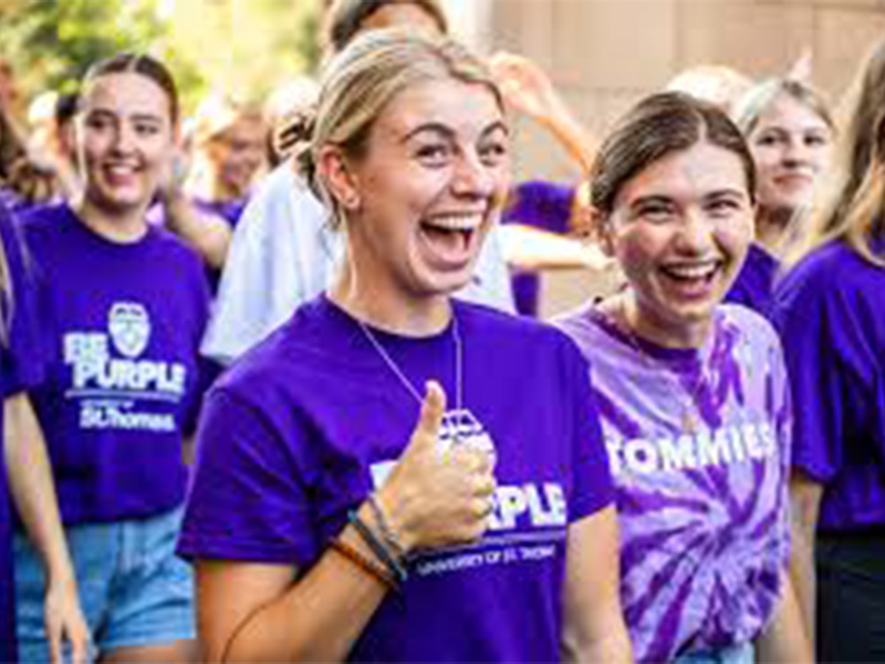
A textbook example of branding with color, right here at home, is the University of Saint Thomas’ claiming of the color purple, specifically Pantone 2607C.

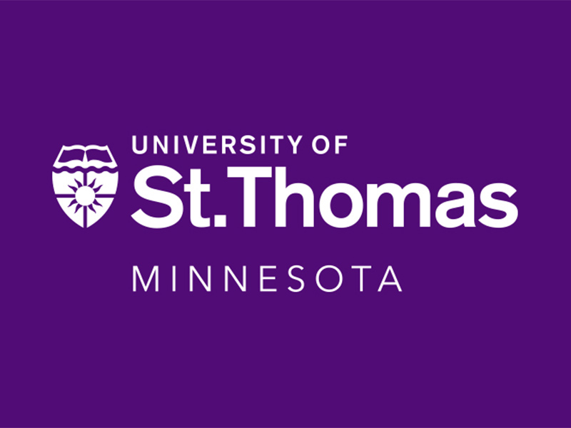
Saint Thomas uses purple for the lighting of their fountain, the carpeting in the corridors, the uniform of their mascot, the football team and fan regalia……

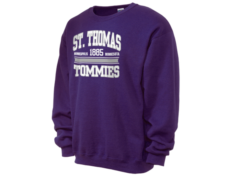
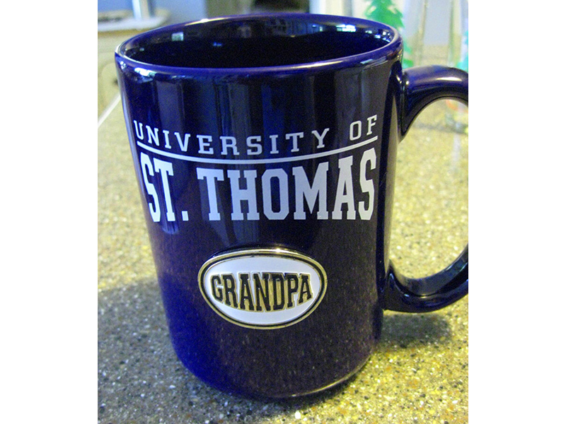
The sell purple sweatshirts…..purple coffee mugs……
It’s a brand so rich that everywhere you look, you drink it in. And when you need relief, Saint Thomas purple, 2607 C, is there for you, too.
WTF
Phil
Phil, your colorful column on the branding power of color has us cheering! Thank you.
Mollie&Tom Raih
– “I’m considering polishing my own concrete floors. Any tips on maintaining the polished look over time?”